Project Goal
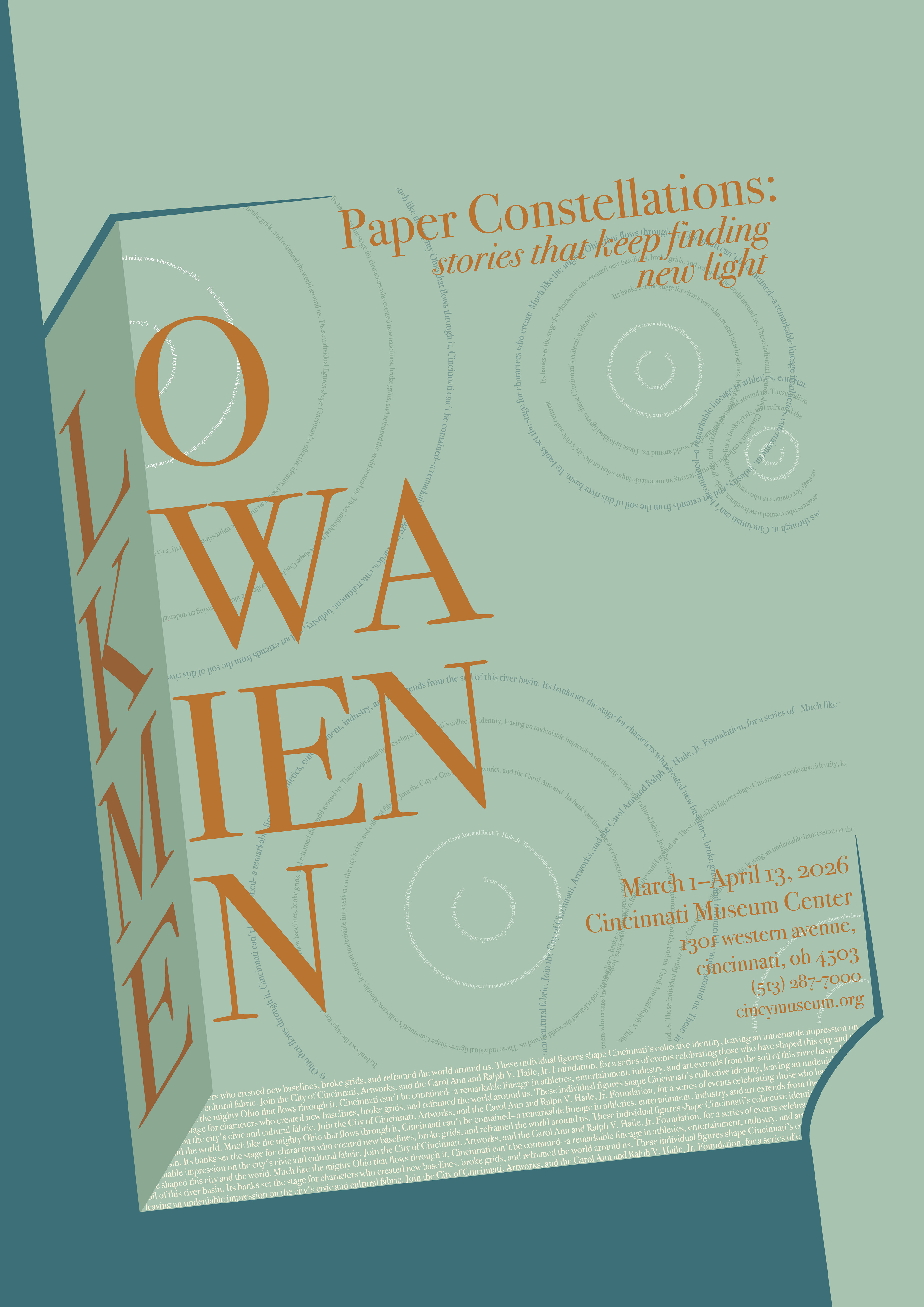
The goal was to create an informative and visually appealing typographic poster about a famous person from Cincinnati. The project focused on using typography to create hierarchy, communicate information, and capture the subject’s significance.
Research
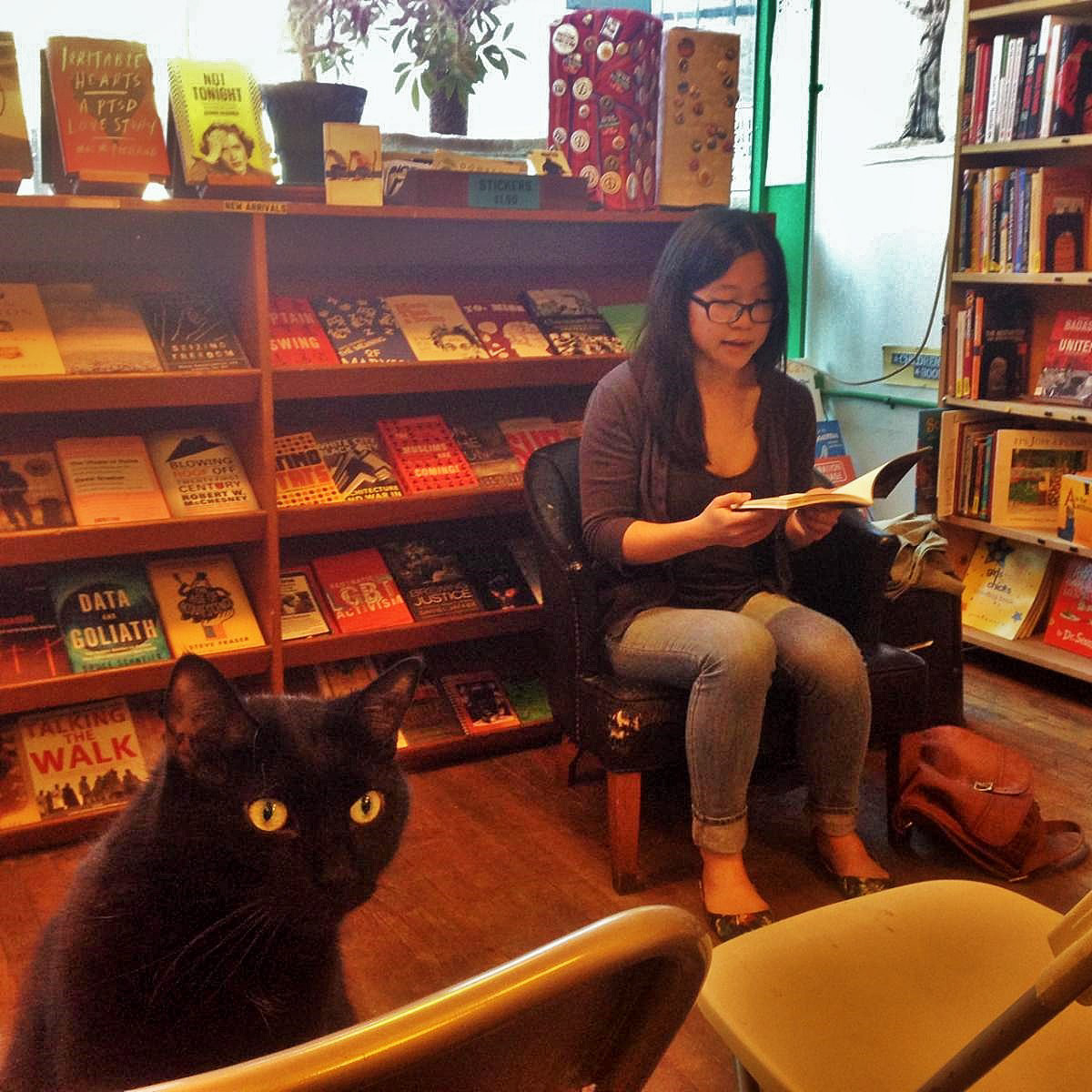
I began by researching Lo Kwa Mien-En, focusing on her background, accomplishments, and connection to Cincinnati. I looked for information that would be both interesting and useful for the poster’s design.
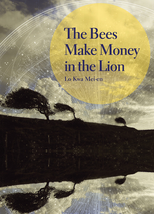
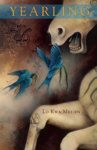
Typographic Exploration
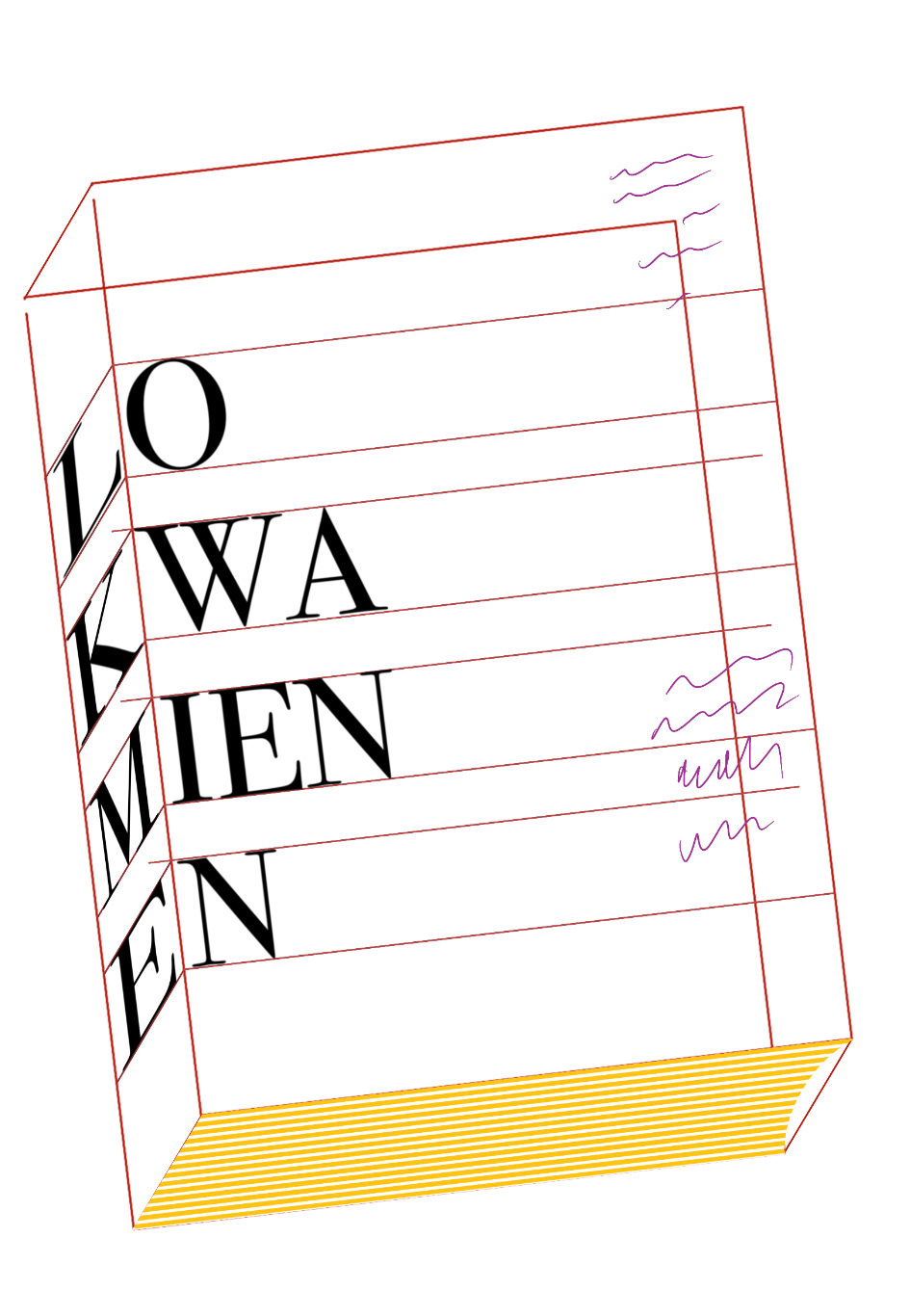
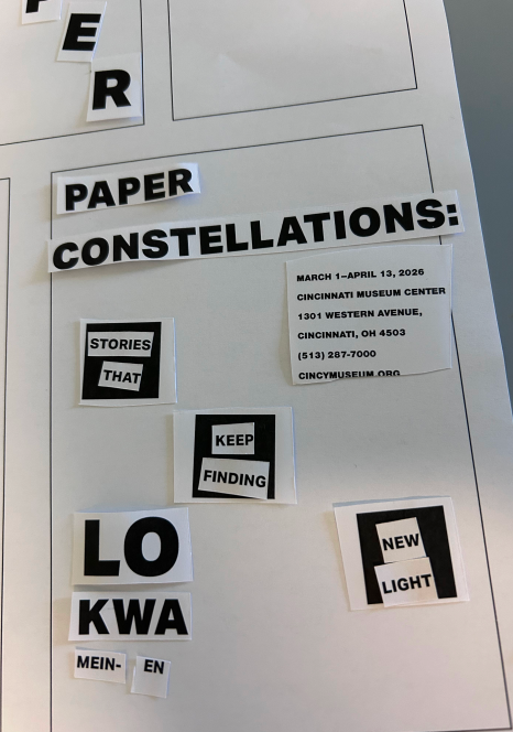
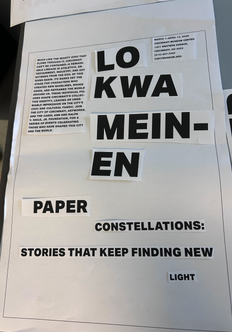
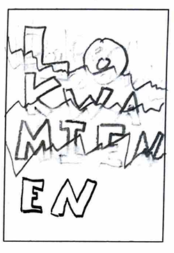
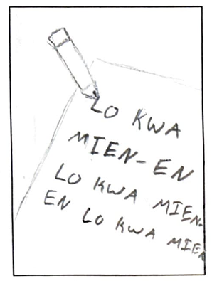
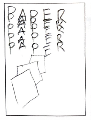
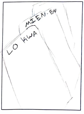
Before starting digital iterations, I experimented with different ways to arrange the words and information on paper. I created rough compositions and sketches to explore how the typography could work together visually.
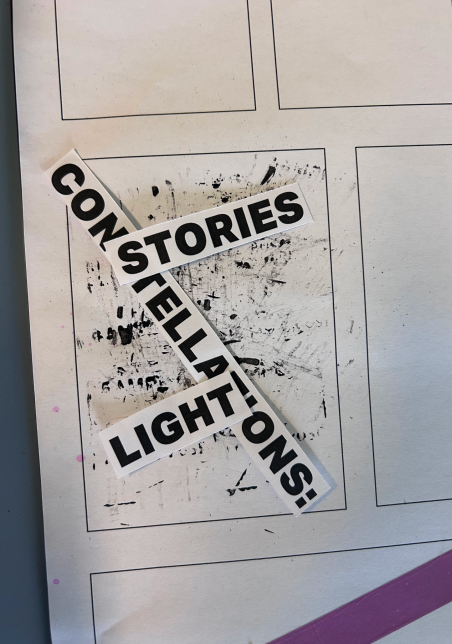
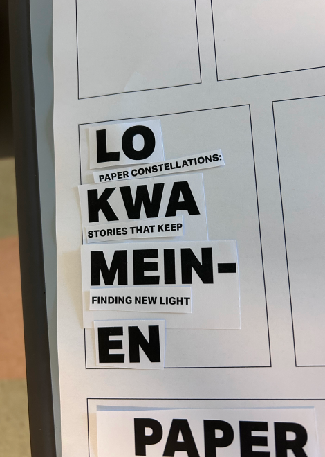
Design Development
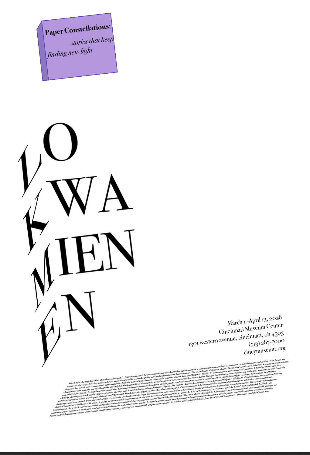
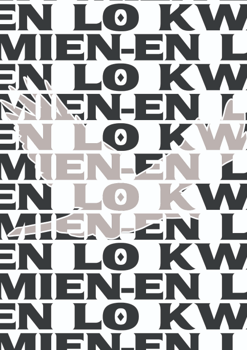
I created digital compositions by experimenting with different layouts and visual elements. I adjusted typography, spacing, scale, color, and imagery to create a clear visual hierarchy without distracting from the information.
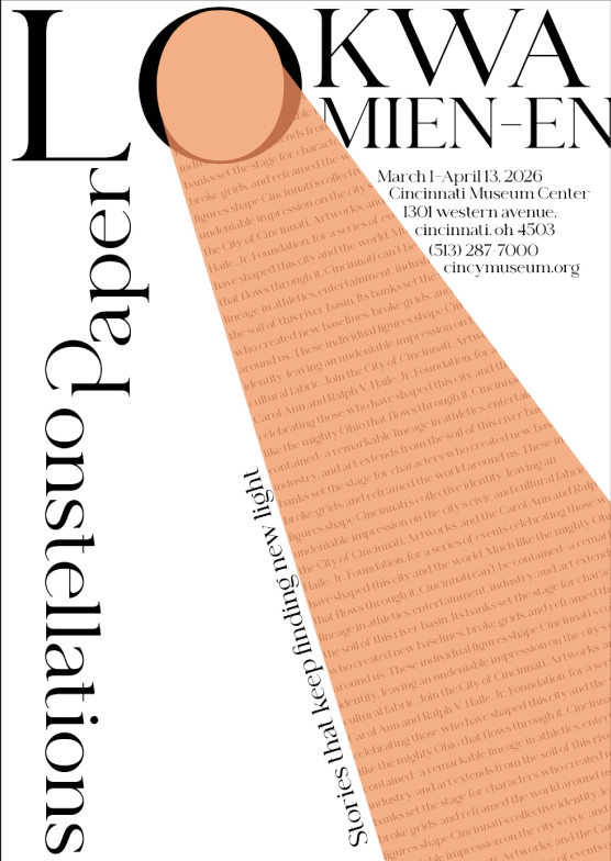
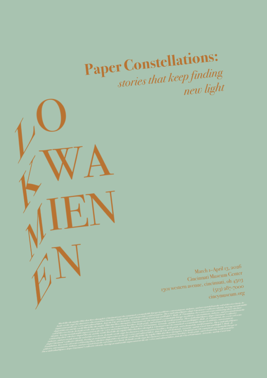
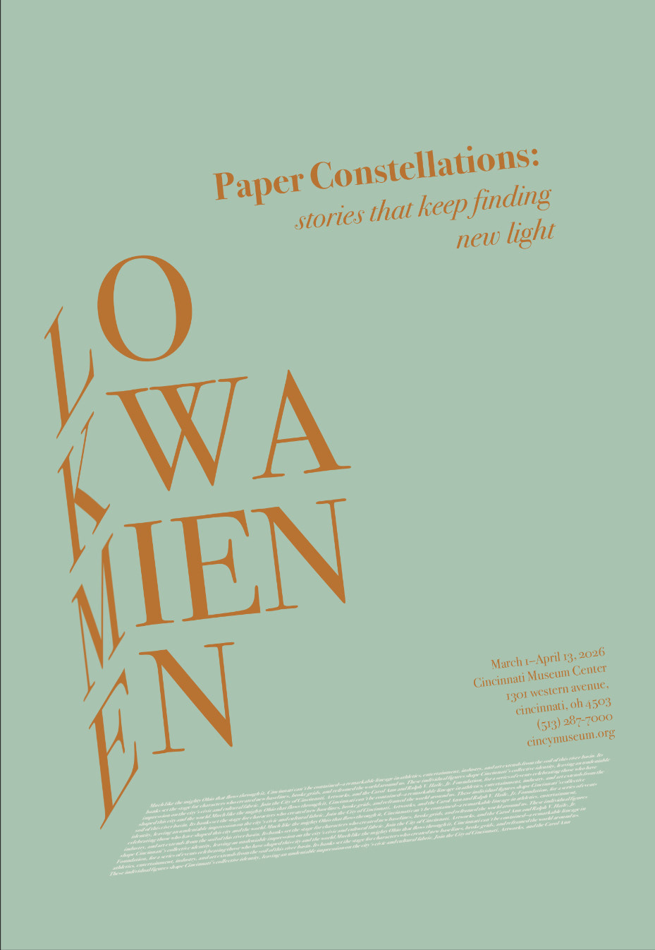
Final Poster
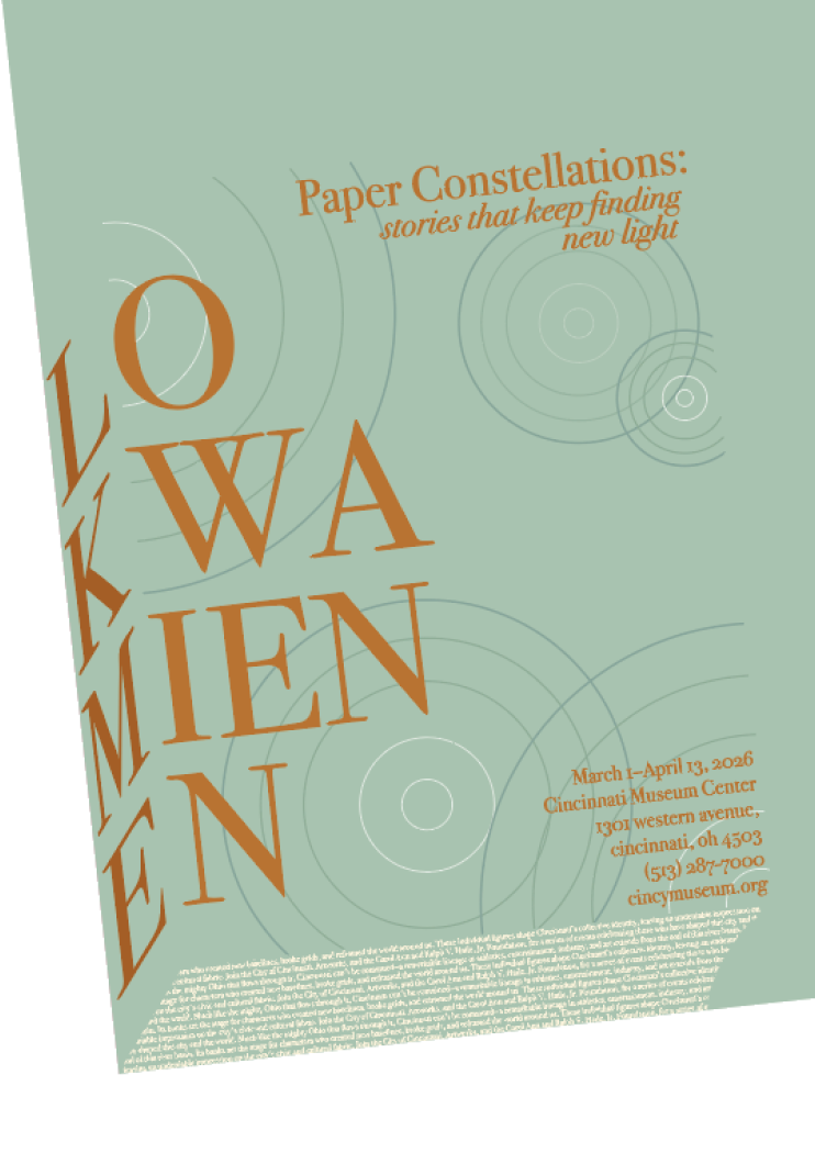
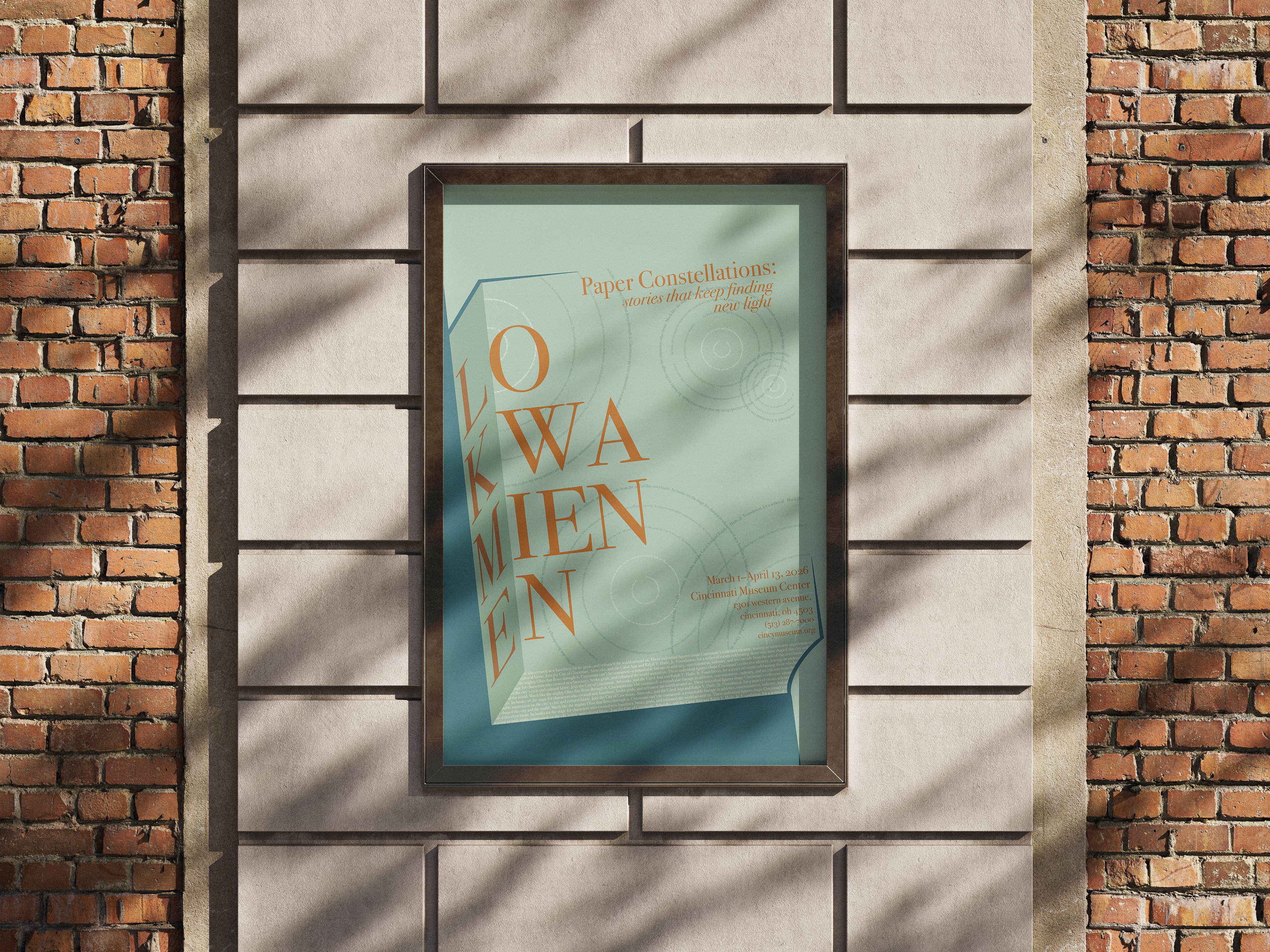
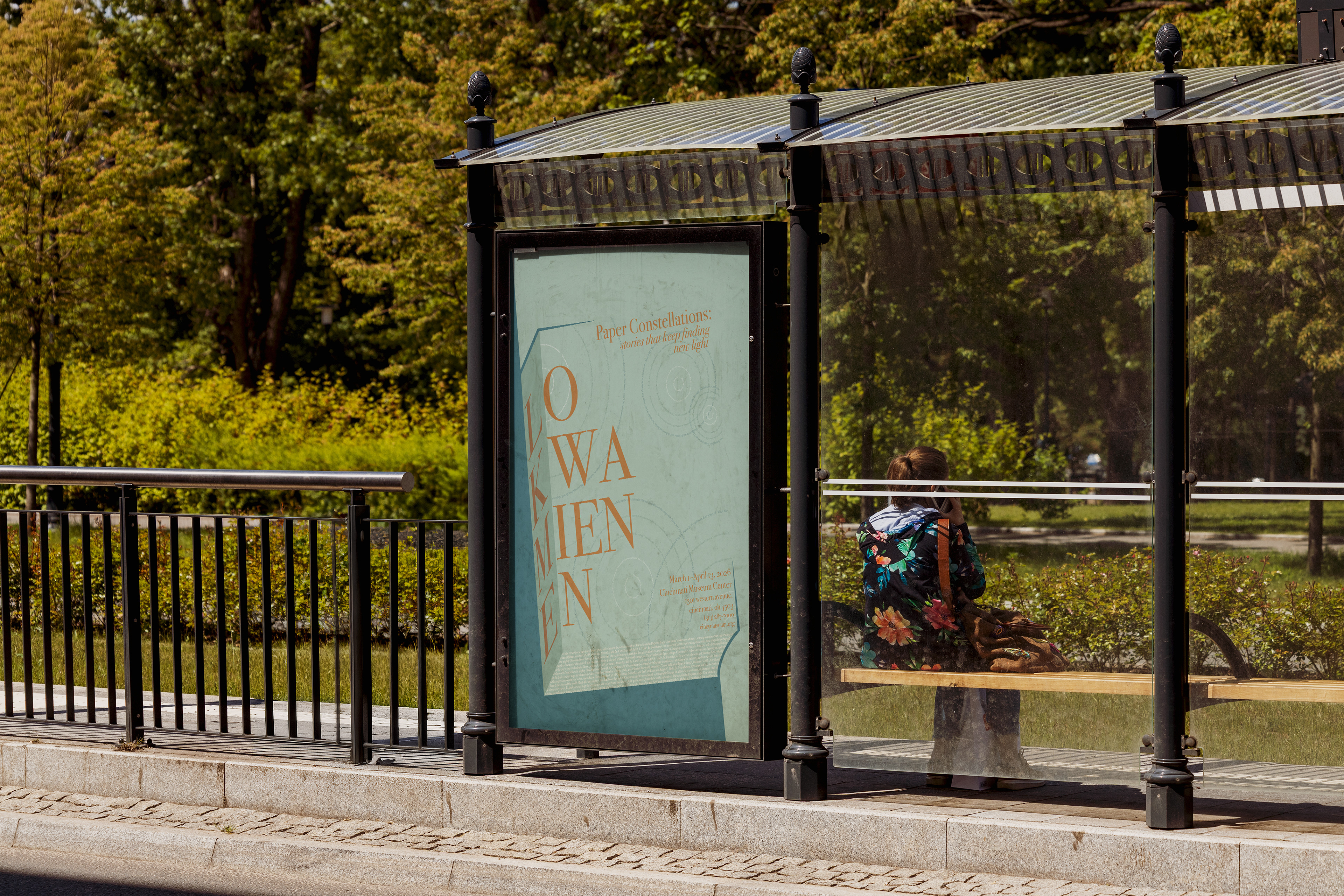
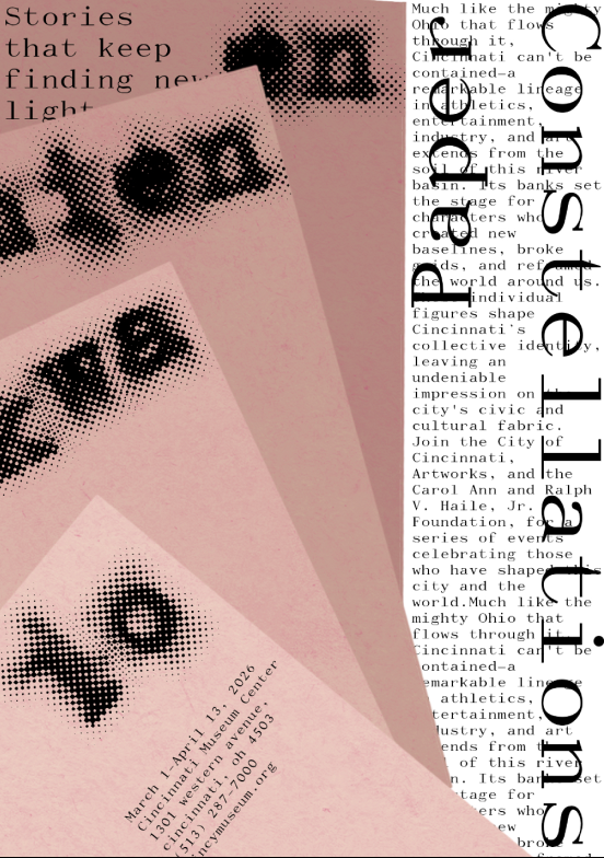
The final poster uses typography as the main visual element, with Lo Kwa Mien-En’s name as the focal point and supporting information sharing her story and connection to Cincinnati. Type size, weight, spacing, and placement guide the viewer while keeping the design clear, memorable, and inspiring.